Helping a Beloved Gathering Place Find a New Voice & Visual Identity
Nestled in the scenic Connecticut River Valley, Deep River Farms has long been a cherished part of the local community as a place where families gather, sunsets are savored, and memories are made. As the farm prepared to reopen under new ownership with a renewed vision, there was a clear need for a brand identity that could honor its deep roots while inviting a new generation to experience its magic.
Dark Blue
#104589
Light Blue
#3981CD
Barn Red
#FF6440
Dark Green
#59933B
Light Green
#A5BE00
Sunshine
#FEC601
Designing the Brand Identity Look and Feel
We paired Dolly, a classic serif with warmth and elegance, with Pacifico, a playful script that evokes hand-painted farm signs and personal connection.
These fonts strike a balance between nostalgic charm and contemporary personality, perfectly reflecting the farm’s mission to honor the past while cultivating joy, creativity, and community for today.
Family & Fun
Animals & Art
Rest & Relax
Memories
Bringing the Vision to Life
One of the biggest challenges in bringing the vision to life was capturing the full spirit of the farm which offers an experience that goes far beyond just produce. From animals and art to live music, a cozy café, and a bustling market, the brand needed to reflect a place that feels both lively and laid back, rooted in community.
We chose fonts that feel warm and approachable, balancing charm with legibility across uses.
Illustration
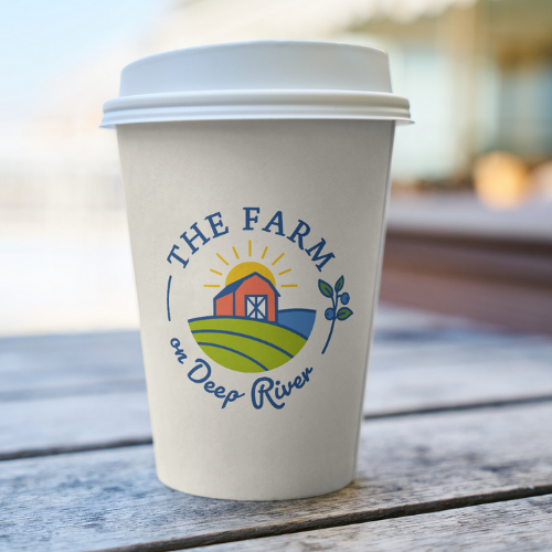
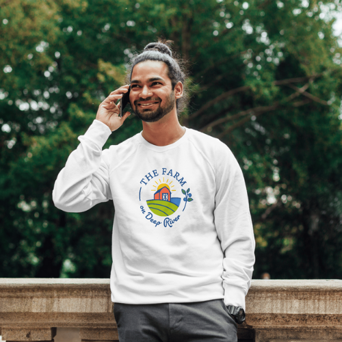
Line work highlights the farm’s unique features, with sunsets taking center stage in the system.
Color Palette
We expanded on the original blue and orange, building a richer palette for future brand growth.
Early Looks at the Branding Process
Early drafts of the logo explored the farm’s rare landscape—where open fields meet the gentle flow of the river. We experimented with both modern and vintage interpretations, aiming to find a visual language that honored the farm’s history while feeling fresh and inviting for a new generation.
KIND WORDS
Thank YOU for making this process so fun and being so great to work with! I LOVE that we did this together and we seem to have been on the same exact page the entire time with it all. It is serendipitous that this whole project has just clicked for us! Thank you so much for being awesome!
Cherie Martorana Neve Owner of The Farm
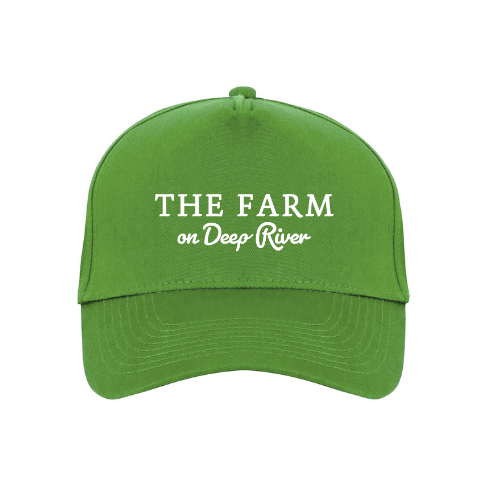
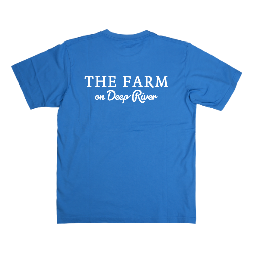
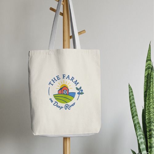
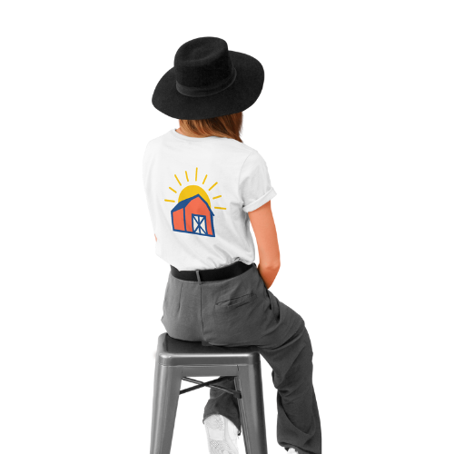
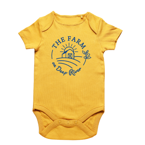
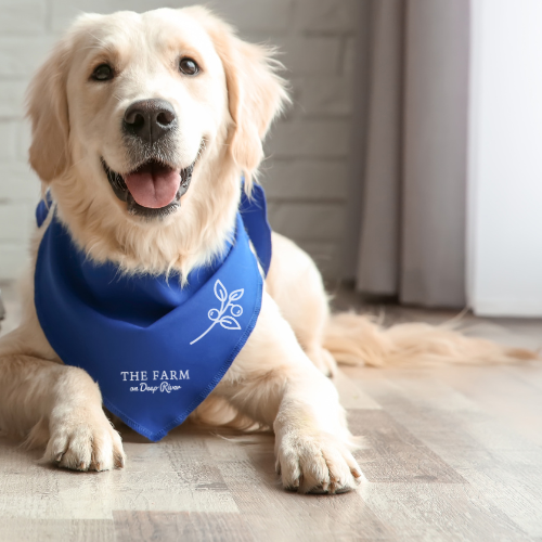
From Concept to Community
Thinking about apparel was an important part of this brand system. We needed something the whole community could wear with pride. From longtime locals to first-time visitors, we wanted the logo to feel just as at home on a tee at the market as it does on a hoodie around town. In a region as close-knit as the tri-town area, the design needed to be versatile, welcoming, and deeply rooted in place.